관점Perspective
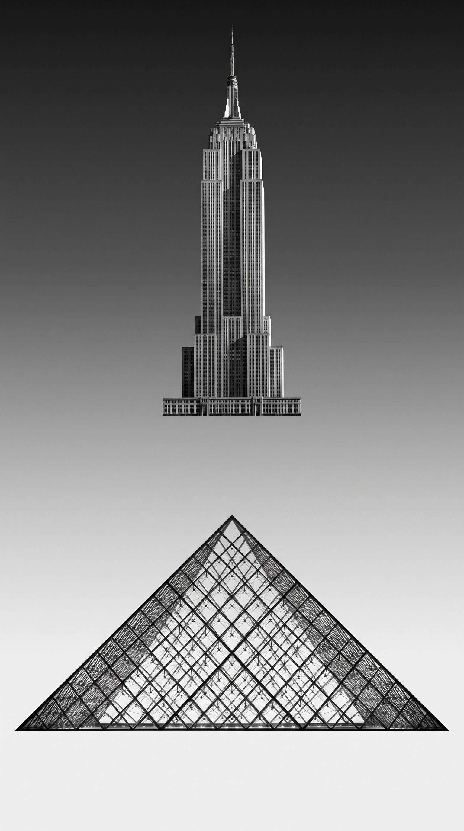
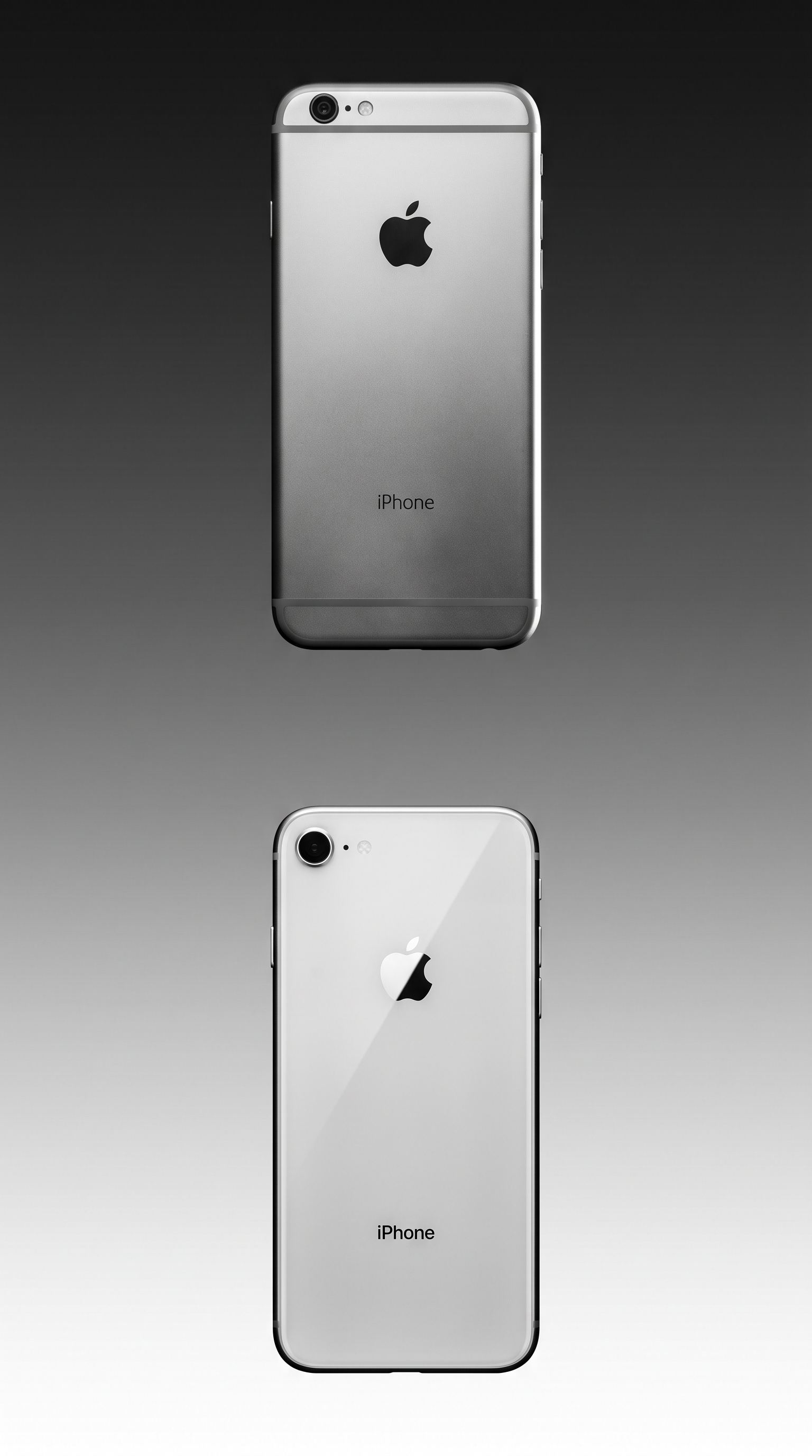
선행 디자인은 브랜드가 어디로 가는지 먼저 보여줘야 한다고 봤습니다. 무엇으로 보여줄지 찾다가, 외장이 차례로 유리로 옮겨 온 흐름을 봤습니다.
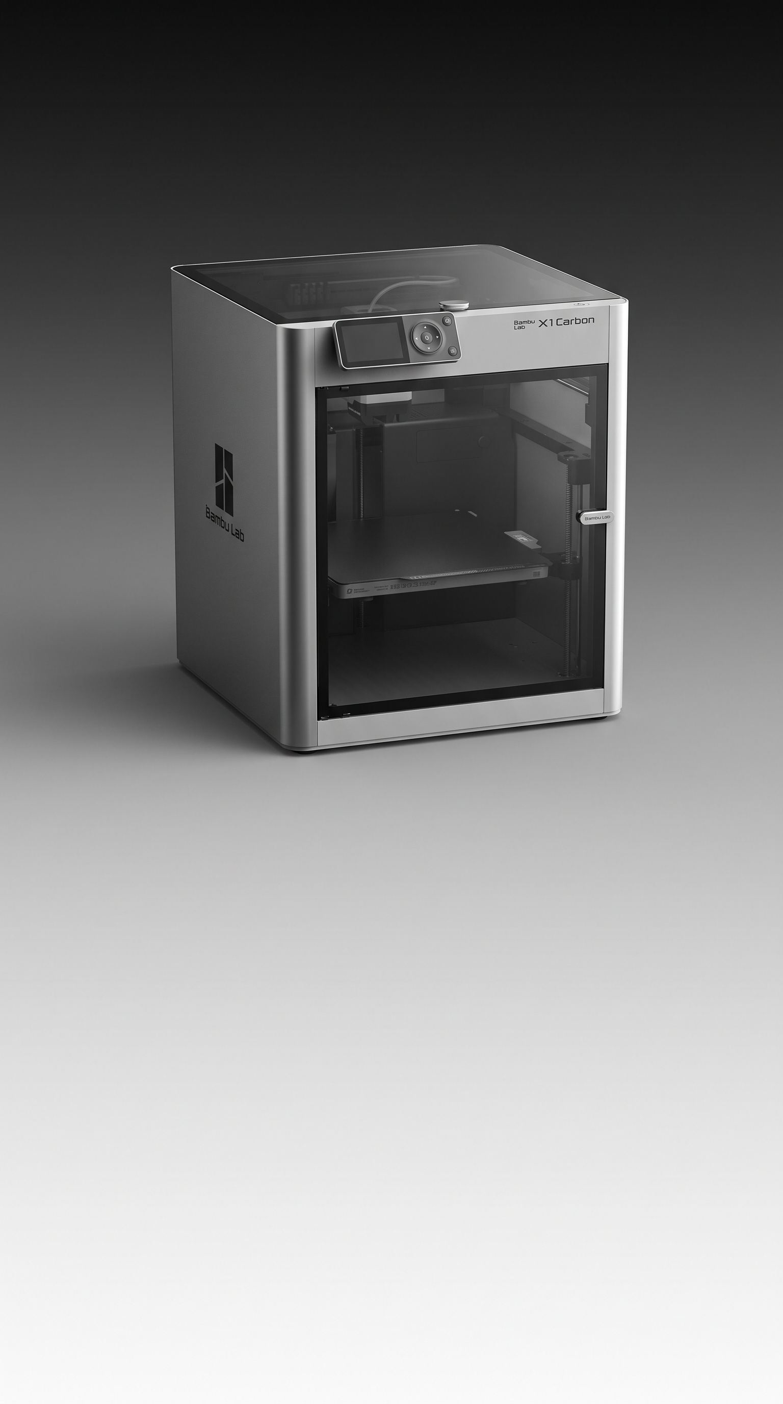
건축이 먼저였고 휴대폰이 뒤를 따랐지만, 프린터는 여전히 유리를 창으로만 쓰는 금속 상자였습니다.
Advanced design has to show where the brand is heading. Looking for what could show it, I saw the same move happen twice — buildings first, then phones, changing their skin to glass. Printers were still metal boxes using glass only as a window.


컨셉Concept
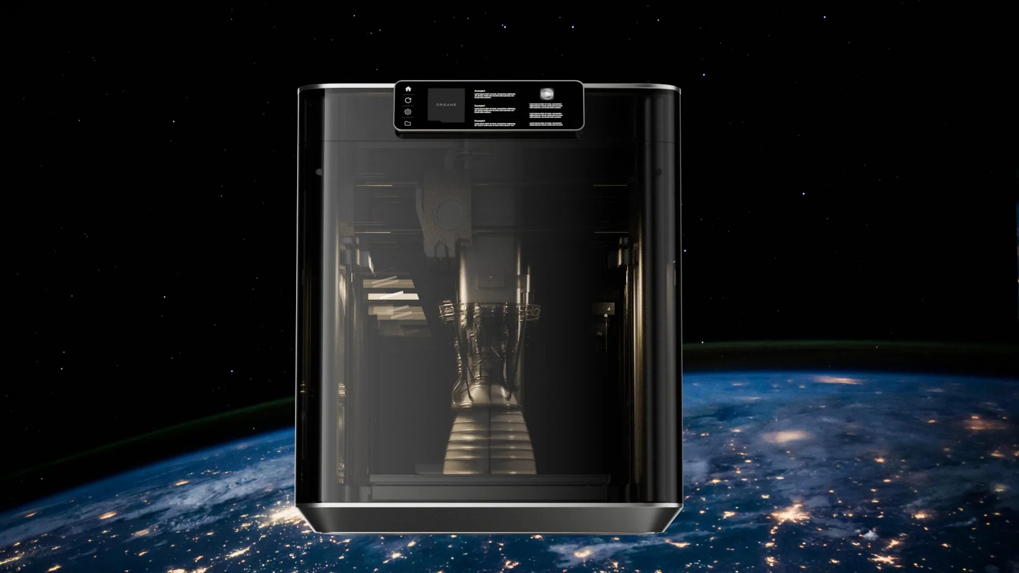
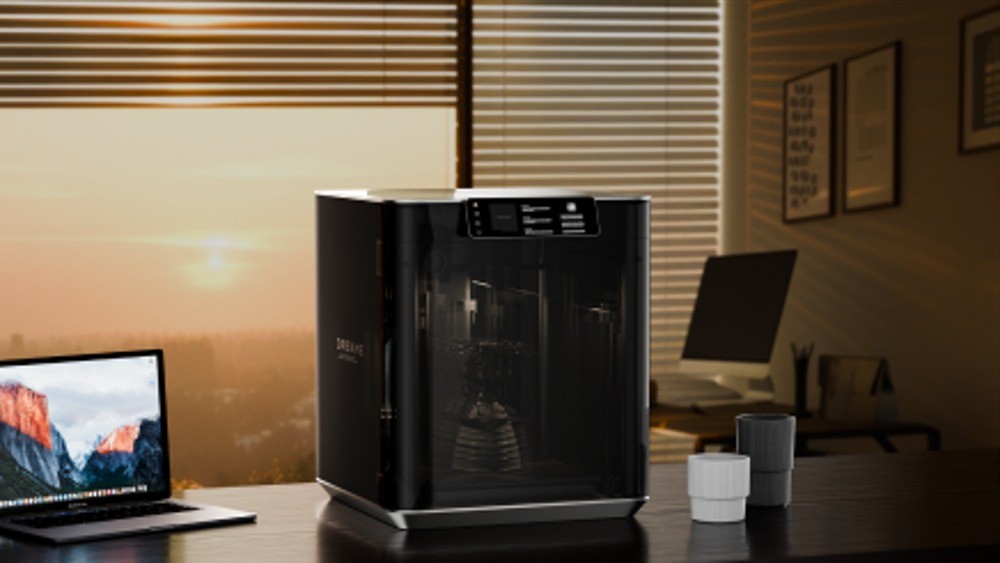
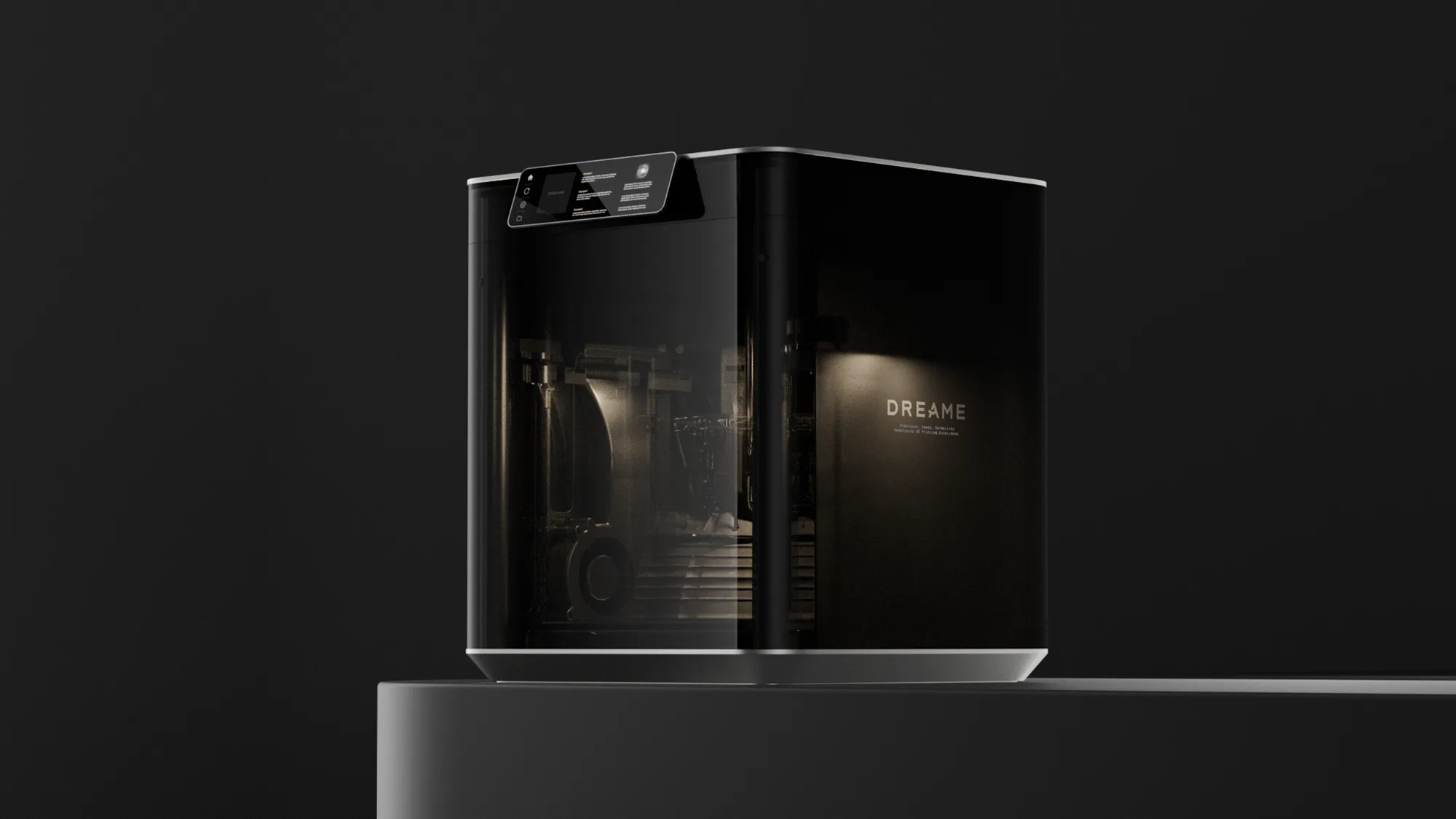
유리를 골랐다고 늘 투명할 필요는 없었습니다. 출력이 없는 시간에 기계 속이 훤히 보이면, 거실에서는 그 자체가 소음이 된다고 판단했습니다.
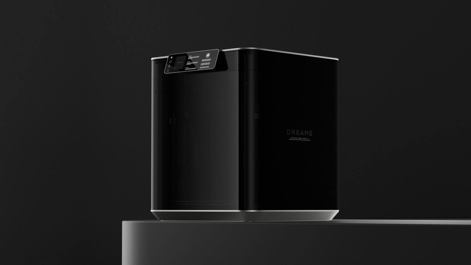
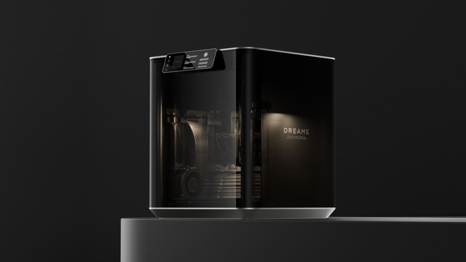
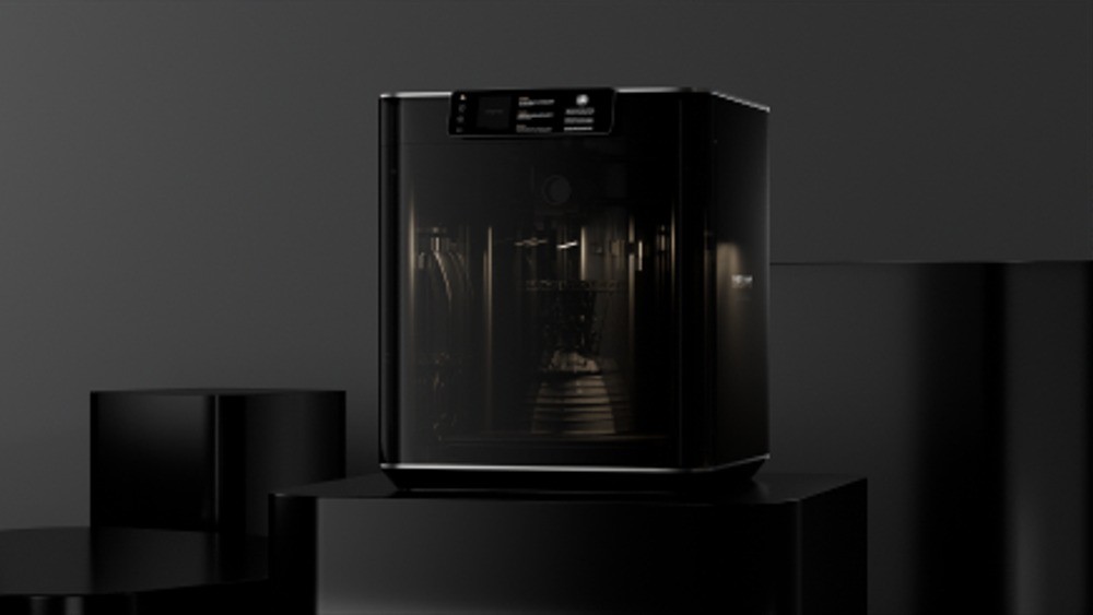
그래서 하나의 유리가 두 상태를 갖게 했습니다. 안이 어두우면 검은 상자로 조용히 있고, 불이 켜지면 만드는 과정이 그대로 보입니다.
제가 제안한 것은 제품 전면을 유리로 바꾸는 방향이었고, 여기에 리드 디자이너가 검은 상자 → 유리 상자라는 개념을 더해 컨셉이 완성됐습니다.
Choosing glass did not mean staying transparent. A machine whose insides are always on show becomes visual noise in a living room, so one piece of glass holds two states. What I proposed was turning the front of the product into glass; the lead designer then added the black box → glass box idea that completed the concept.


디테일Detail
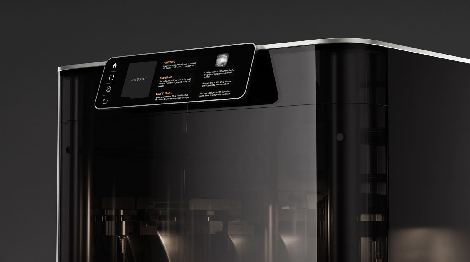
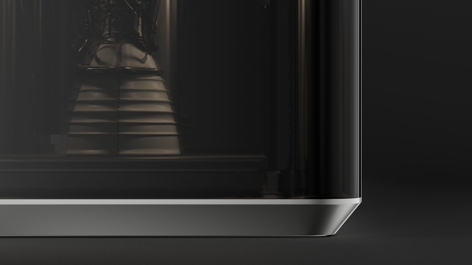
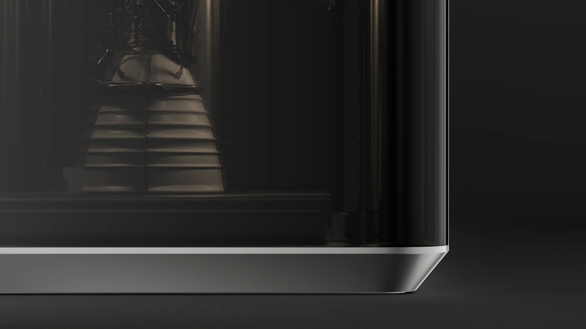
조작부는 상단의 얇은 패널로 모으고, 바닥은 금속 띠로 받쳐 전체를 띄워 보이게 했습니다.
The controls gather into a thin panel at the top, and a metal band at the base lifts the whole volume visually.


이후After
여러 팀의 반려가 이어지던 과제에서 감출 것과 드러낼 것을 다시 정의한 결과였습니다.
It came out of redefining what to hide and what to reveal on a brief that other teams had turned down.